Plots.jl+StatsPlots.jlでグラフを描画する
普段使うグラフのメモ。
Jupyterから出力されたMarkdownを貼り付けただけなので見苦しいところもありますが、ご容赦ください…。
versioninfo()

#    Julia Version 1.2.0
#    Commit c6da87ff4b (2019-08-20 00:03 UTC)
#    Platform Info:
#      OS: macOS (x86_64-apple-darwin18.6.0)
#      CPU: Intel(R) Core(TM) i7-6700K CPU @ 4.00GHz
#      WORD_SIZE: 64
#      LIBM: libopenlibm
#      LLVM: libLLVM-6.0.1 (ORCJIT, skylake)
using Plots  # v0.28.4
using StatsPlots  # v0.13.0
gr();  # 今回バックエンドはGR
基本
Plots.jlおよびStatsPlots.jlのplot関数の基本は
plot(X, Y, seriestype=:foo)
という形になります。(数値データを2つ受け取るような場合)
X, Yはそれぞれ1次元の数値データが入ります。(行列を渡すと列分割したものが代入される)
:fooの部分には:lineや:scatterや:heatmapなどのグラフの形式が入ります。
また、seriestypeに指定できるものはそのまま関数名としても使えるものもあり、例えばscatter(X,Y)はplot(X,Y,seriestype=:scatter)と同じグラフになります。以下では前者のscatter(X,Y)の形を使っていきます。
seriestypeの一覧はplotattr("seriestype"))で見ることができ、執筆時点のバージョンでは
:none, :line, :path, :steppre, :steppost, :sticks, :scatter, :heatmap, :hexbin, :barbins, :barhist, :histogram, :scatterbins, :scatterhist, :stepbins, :stephist, :bins2d, :histogram2d, :histogram3d, :density, :bar, :hline, :vline, :contour, :pie, :shape, :image, :path3d, :scatter3d, :surface, :wireframe, :contour3d, :volume
となっています。plot()の引数は他にもたくさんあるのですが、以下で示す例で追って確認してもらえればと思います。
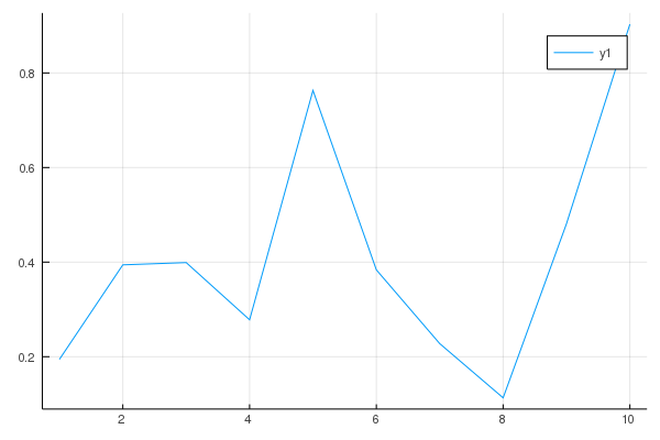
折れ線グラフ
y = rand(10)
plot(1:10, y)  # seriestypeに何も指定しなければ折れ線グラフになる
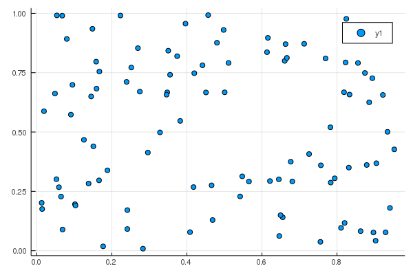
散布図
x = rand(100)
y = rand(100)
scatter(x, y)  # plot(x, y, seriestype=:scatter)でもOK
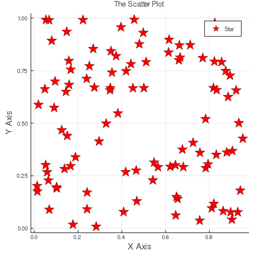
以下のように引数を追加することでグラフの見た目を変更できます。
詳しくはAttributes - Plotsを参照のこと。
scatter(x, y,
    size=(500,500), color="#FF0000", xlabel="X Axis", ylabel="Y Axis",
    title="The Scatter Plot", titlefontsize=10,
    markersize=10, markershape=:star, label="Star")
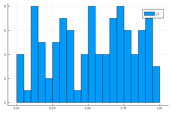
ヒストグラム
x = rand(100)
histogram(x, bins=20)
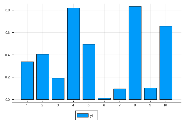
棒グラフ
x = rand(10)
bar(x, xticks=1:10, legend=:outerbottom)  # legendに指定できる引数はplotattr("legend")で確認できる…が一部網羅されていないので注意
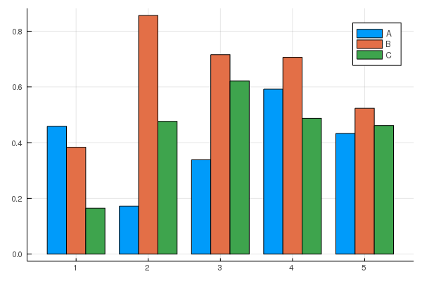
グループ化棒グラフ
このグループ化棒グラフと下の積み上げ棒グラフはPlots.jlではなくStatsPlot.jlの関数です。
x = rand(5)
y = rand(5)
z = rand(5)
@show x
@show y
@show z
groups = repeat(["A", "B", "C"], inner=5)
@show groups

# groupedbarは数値引数は一つにまとめないといけないっぽい
groupedbar(hcat(x, y, z), group = groups, bar_position=:dodge)

# x = [0.7367081125672426, 0.12101121231403522, 0.5592890690659404, 0.09434858010466729, 0.9728276872619399]
# y = [0.17391265129032307, 0.05712947439612237, 0.40888954729278537, 0.7889088594726457, 0.5882365513190684]
# z = [0.3523316775756147, 0.6016755080216036, 0.25990140108919735, 0.6026063400672748, 0.28232229448460955]
# groups = ["A", "A", "A", "A", "A", "B", "B", "B", "B", "B", "C", "C", "C", "C", "C"]
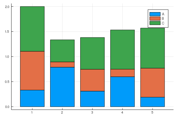
積み上げ棒グラフ
x = rand(5)
y = rand(5)
z = rand(5)
@show x
@show y
@show z
groups = repeat(["A", "B", "C"], inner=5)
@show groups

# groupedbarは数値引数は一つにまとめないといけないっぽい
groupedbar(hcat(x, y, z), group = groups, bar_position=:stack)

# x = [0.04262221302161695, 0.6055514860018574, 0.6965557039336798, 0.8948376220099088, 0.00872153461803471]
# y = [0.6784497653903234, 0.6493541838788504, 0.7103558738376547, 0.9469376103365552, 0.9076511866614223]
# z = [0.42620086449962447, 0.649137141928829, 0.02875359364905905, 0.8594958398088803, 0.17110218260753607]
# groups = ["A", "A", "A", "A", "A", "B", "B", "B", "B", "B", "C", "C", "C", "C", "C"]
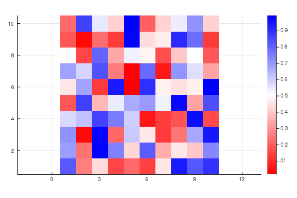
ヒートマップ
mat = rand(10,10)
heatmap(mat)
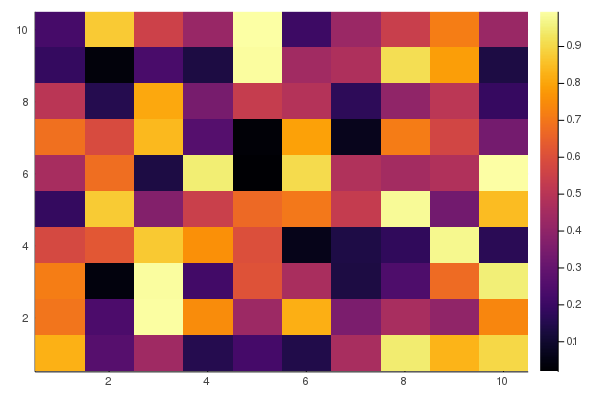
#  色を変えたいときはcolorを指定。RGBでも色名でもOK. 四角の縦横比はaspect_ratio
heatmap(mat, color=cgrad(["#FF0000", :white, :blue], [0.0, 0.5, 1.0]), aspect_ratio=1)
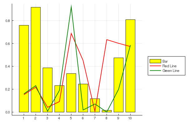
グラフを重ねる
グラフを重ねるためにはplot!やscatter!のように破壊的関数を用います
x = rand(10)
y = rand(10)
z = rand(10)
plt = bar(x, xticks=1:10, legend=:outerright, color=:yellow, label="Bar")
plot!(plt, y, linewidth=2, color=:red, label="Red Line")
plot!(plt, z, linewidth=2, color=:green, label="Green Line")
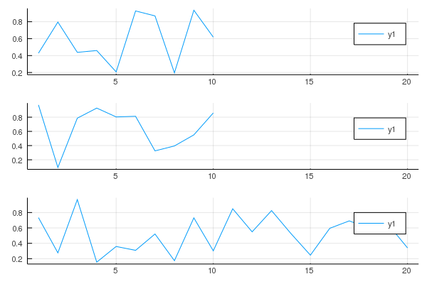
グラフを並べる
グラフを並べるにはplotでそれぞれの関数を囲ってやるだけです。とても簡単。
より詳しくはLayouts - Plotsを参照
x = rand(10)
y = rand(10)
z = rand(20) # 1つだけ長い系列にしてみる
plot(
    plot(x),
    plot(y),
    plot(z),
    layout=(3,1),  # 3行1列
    link=:x  # x軸を共有
)
参考
- Plots - 基本的にこれを見れば大丈夫ではあるものの、若干サンプルコードが少なくてとっつきにくいのが難点。
- cheatsheets/plotsjl-cheatsheet.pdf at master · sswatson/cheatsheets - いわゆるチートシート。必要最低限なことがしっかりまとまっています。